Brand Identity / Package System
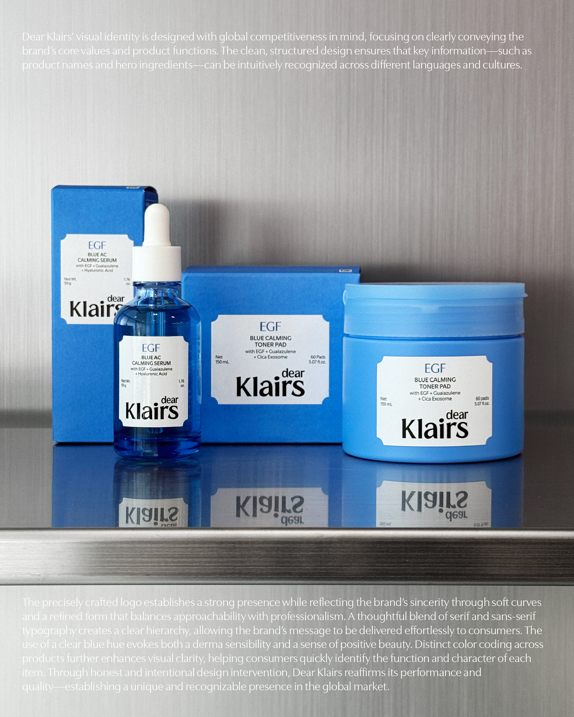
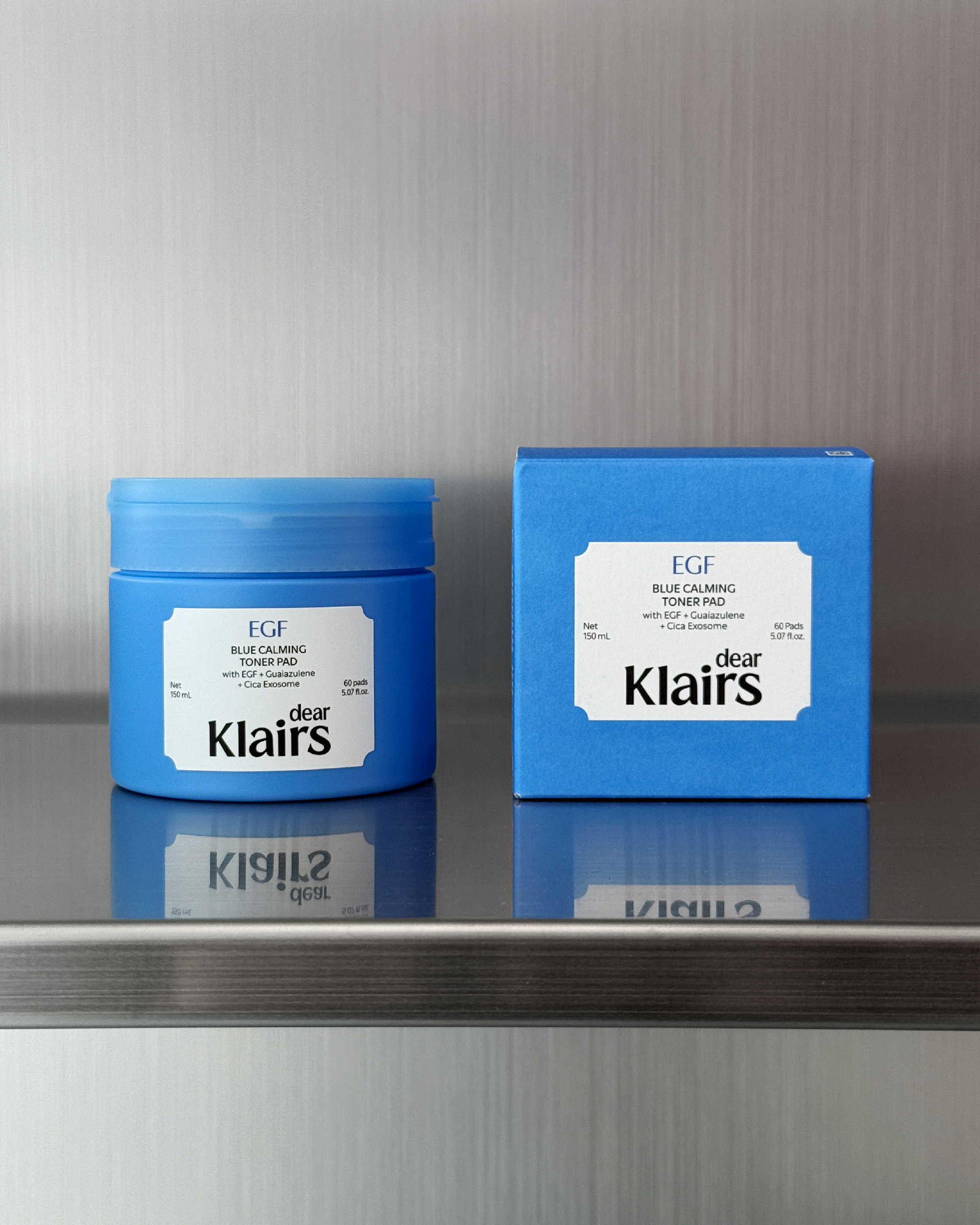
Dear Klairs’ visual identity is designed with global competitiveness in mind, focusing on clearly conveying the brand’s core values and product functions. The clean, structured design ensures that key information—such as product names and hero ingredients—can be intuitively recognized across different languages and cultures.
The precisely crafted logo establishes a strong presence while reflecting the brand’s sincerity through soft curves and a refined form that balances approachability with professionalism. A thoughtful blend of serif and sans-serif typography creates a clear hierarchy, allowing the brand’s message to be delivered effortlessly to consumers.
The use of a clear blue hue evokes both a derma sensibility and a sense of positive beauty. Distinct color coding across products further enhances visual clarity, helping consumers quickly identify the function and character of each item. Through honest and intentional design intervention, Dear Klairs reaffirms its performance and quality—establishing a unique and recognizable presence in the global market.