Hangul Logos Vol. 1
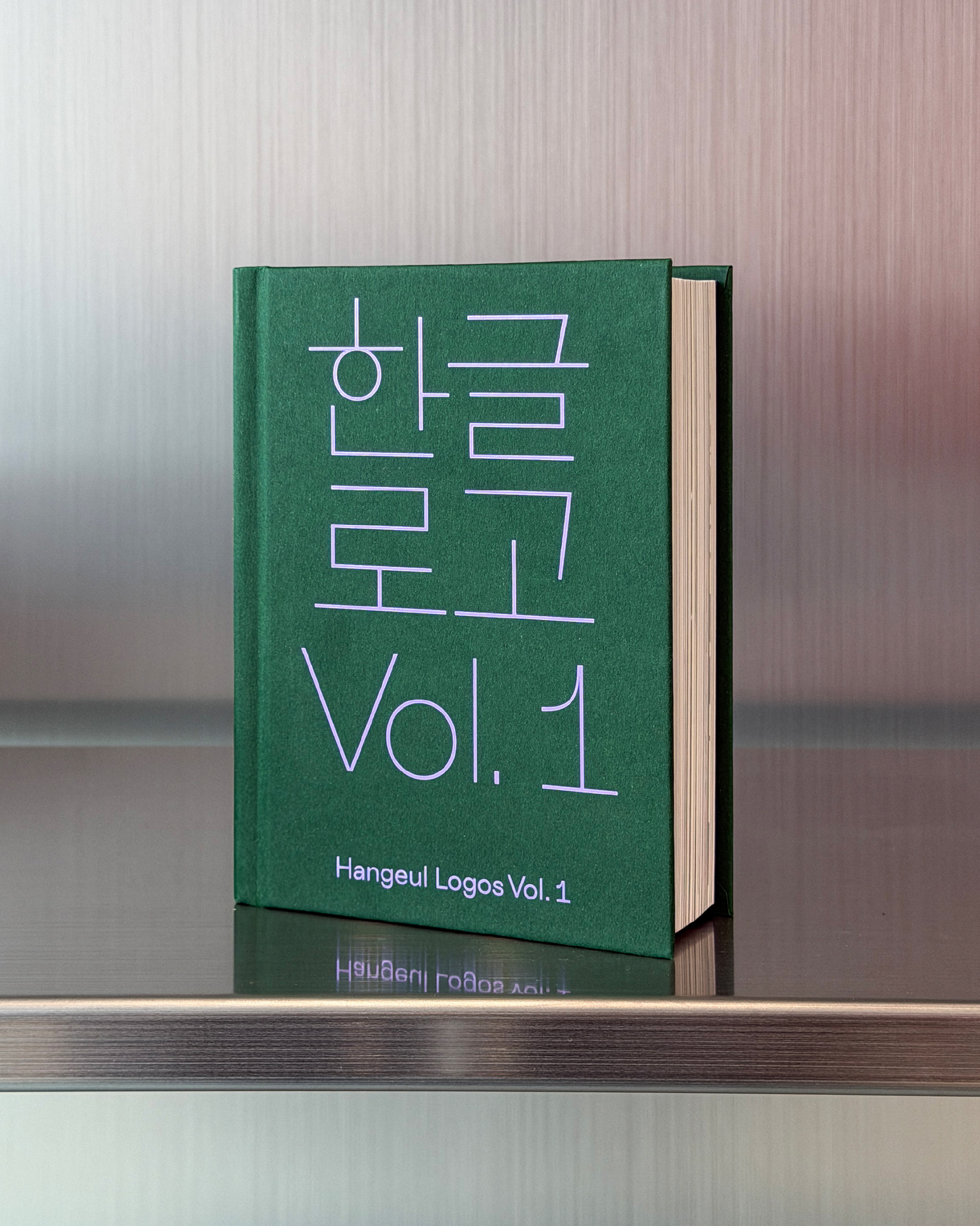
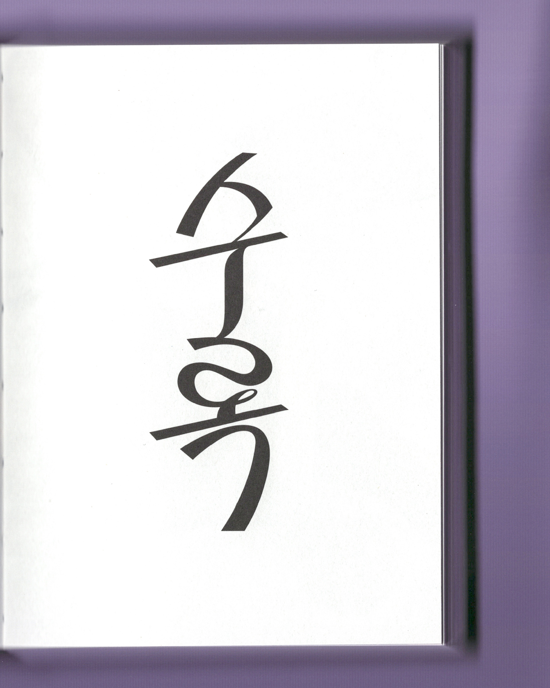
Two of our logotype projects have been featured in Hangul Logos Vol. 1, a publication dedicated to documenting contemporary Korean logotype design.
The book archives a wide range of Hangul identities created across different industries, highlighting how typography can express each brand’s unique character and perspective.
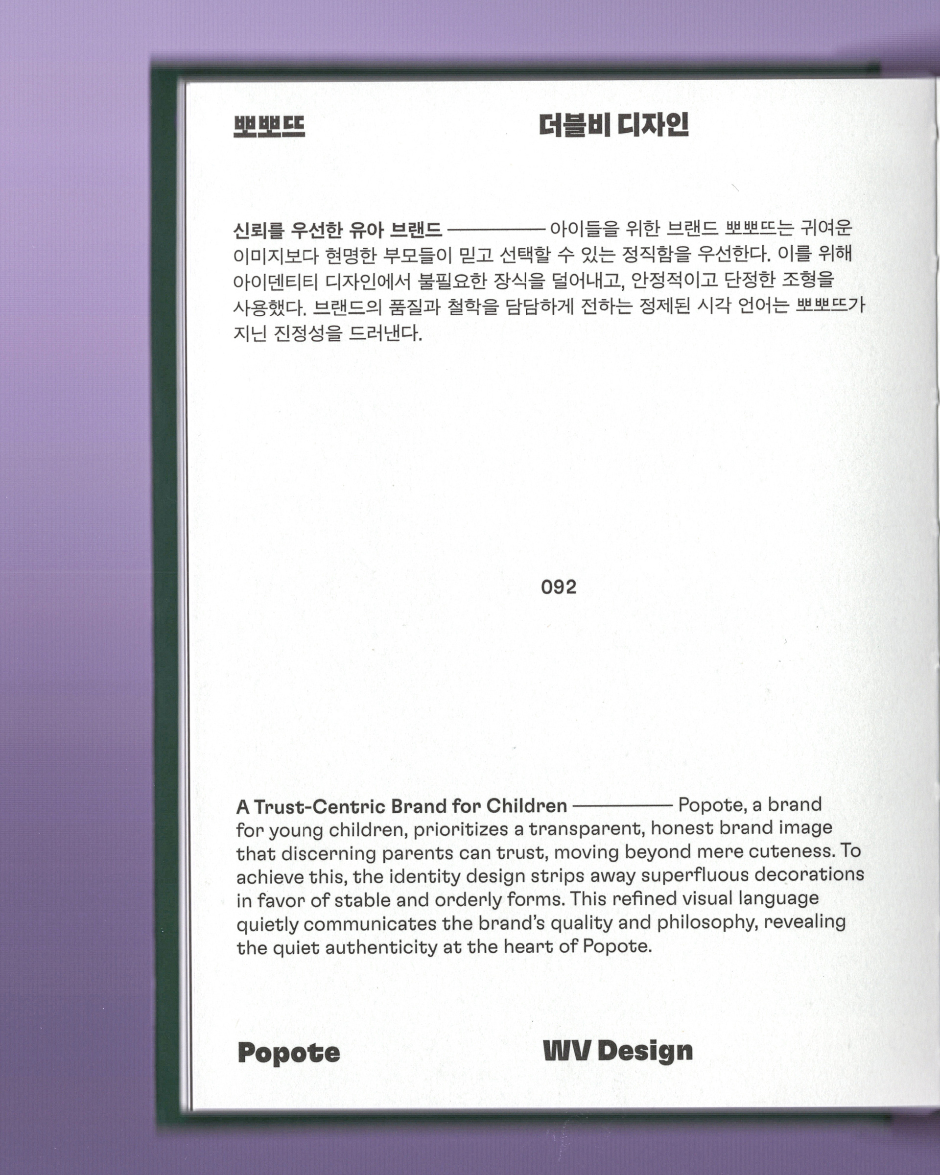
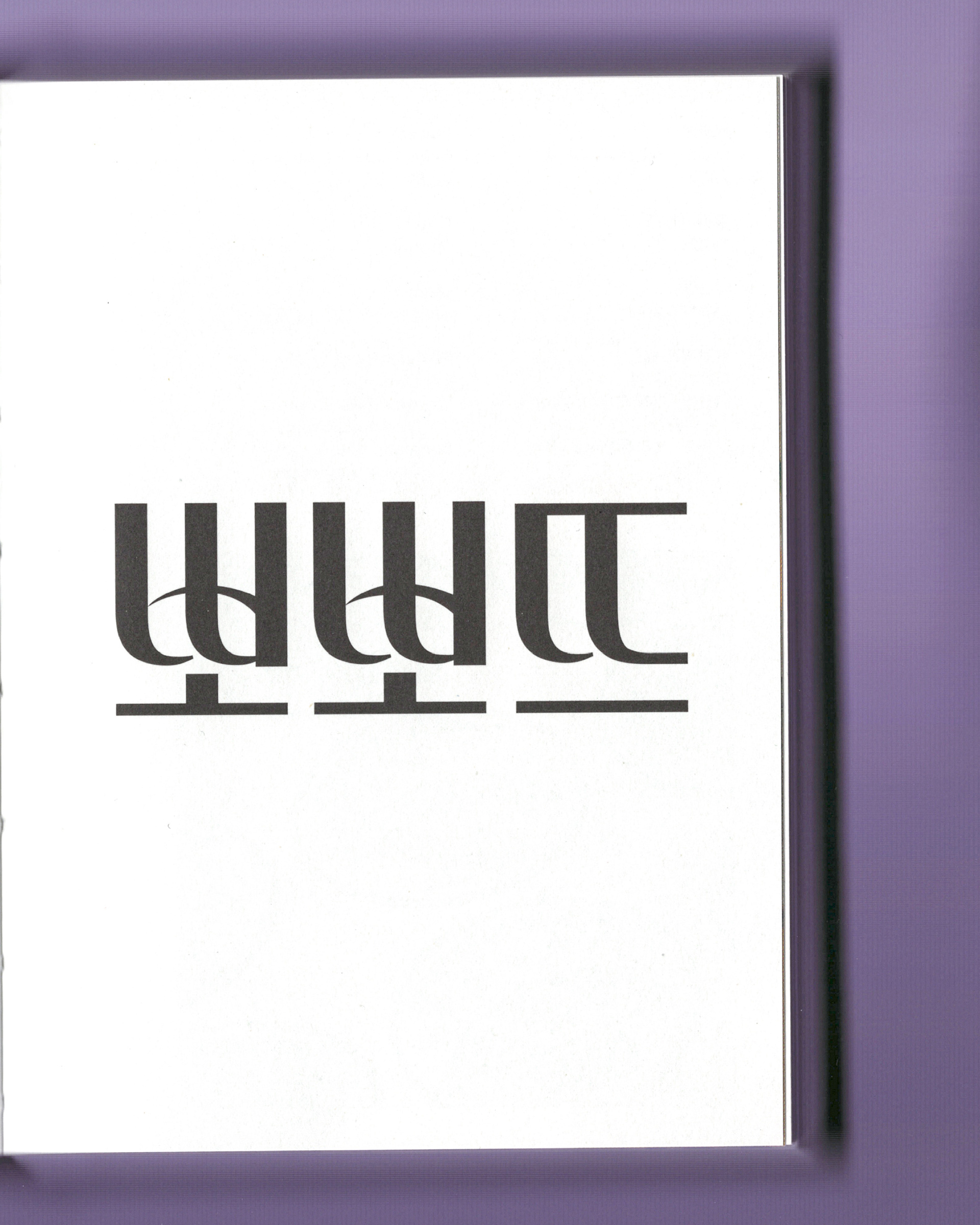
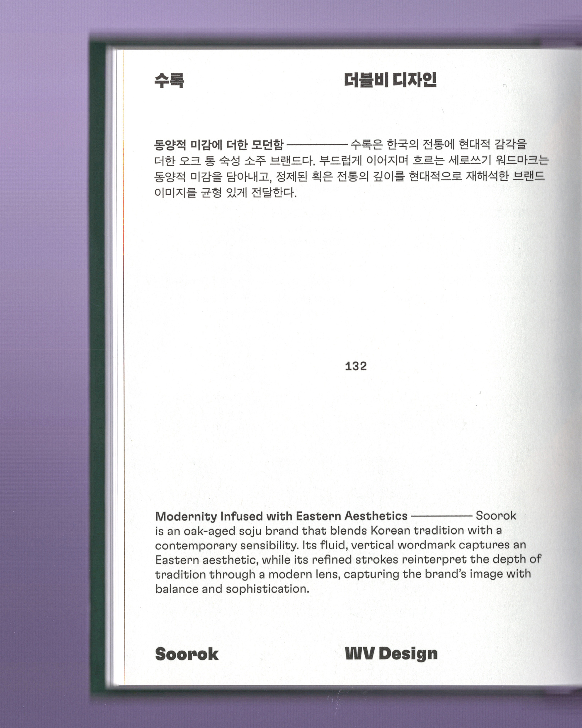
Our work for Popote and Soorok was selected as part of this collection, each exploring a distinct approach to Korean wordmark design while reflecting the identity of the brands they represent.
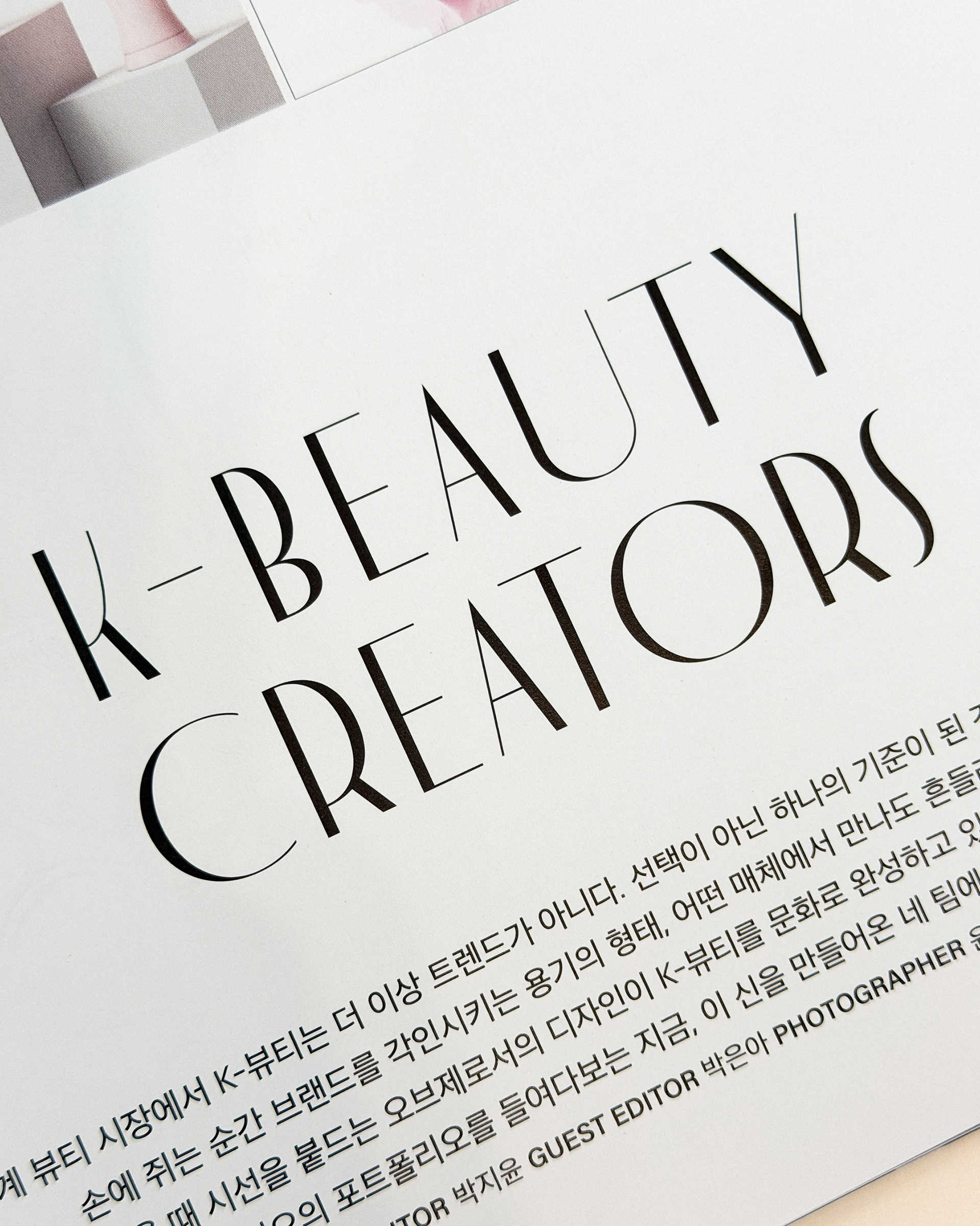
We believe typography is more than a way to write a name. It is one of the most enduring expressions of a brand’s identity, and we are pleased to see these works preserved as part of this archive.