완벽을 넘어선 매력적인 브랜드를 디자인합니다.
오랜시간 사랑받을 수 있는 브랜드 아이덴티티를 구축하기 위해 전방위적인 브랜드 활동을 지원하고, 시장이 주목하는 브랜드를 만듭니다.
오랜시간 사랑받을 수 있는 브랜드 아이덴티티를 구축하기 위해 전방위적인 브랜드 활동을 지원하고, 시장이 주목하는 브랜드를 만듭니다.
Brand
Oenir
WAVE MODEL
WV
TinN
Laka
Celliviate
ILEG
Torriden BI Renewal
Biorchestra
잠깐학교
612 Language Institute
SM Town&Store
Oenir
WAVE MODEL
WV
TinN
Laka
Celliviate
ILEG
Package
Celliviate
Forest Shower
KUMO Holiday Kit
Torriden Package Renewal
Della Born
Torriden Dive in Serum
Torriden Influncer Kit
Torriden Sachet Kit
NOVOMICS Hello Kit
bbb.B / Baobab Brolly
Eat 4 U 수채지가
Eat 4 U 나만의 비밀 Water Mix
완벽한 시간을 위한 오브제
Eat 4 U 위대한 비밀
Web
WV Design
Celliviate
Torriden Renewal
612 Language Institute
Furniture
긋다
Celliviate
Forest Shower
KUMO Holiday Kit
Torriden Package Renewal
Della Born
Torriden Dive in Serum
Torriden Influncer Kit
Torriden Sachet Kit
NOVOMICS Hello Kit
bbb.B / Baobab Brolly
Eat 4 U 수채지가
Eat 4 U 나만의 비밀 Water Mix
완벽한 시간을 위한 오브제
Eat 4 U 위대한 비밀
Web
WV Design
Celliviate
Torriden Renewal
612 Language Institute
Furniture
긋다
Product
Laka
TinN_Shampoobar
Laka Soul Vegan Lip Balm
bbb.B / Baobab Brolly
Club Jasmine 2019 Calendar
Used Hair Dryer
Puffy Bookmark
Holder Series
Oasis
The Contrast
Lego Farm
Lighting Bag
Poster
We Need A Strong Hammer
Photo&Video Direction
Celliviate
Torriden BI Renewal
bbb.B / Baobab Brolly
Service Design
HEYGROUND

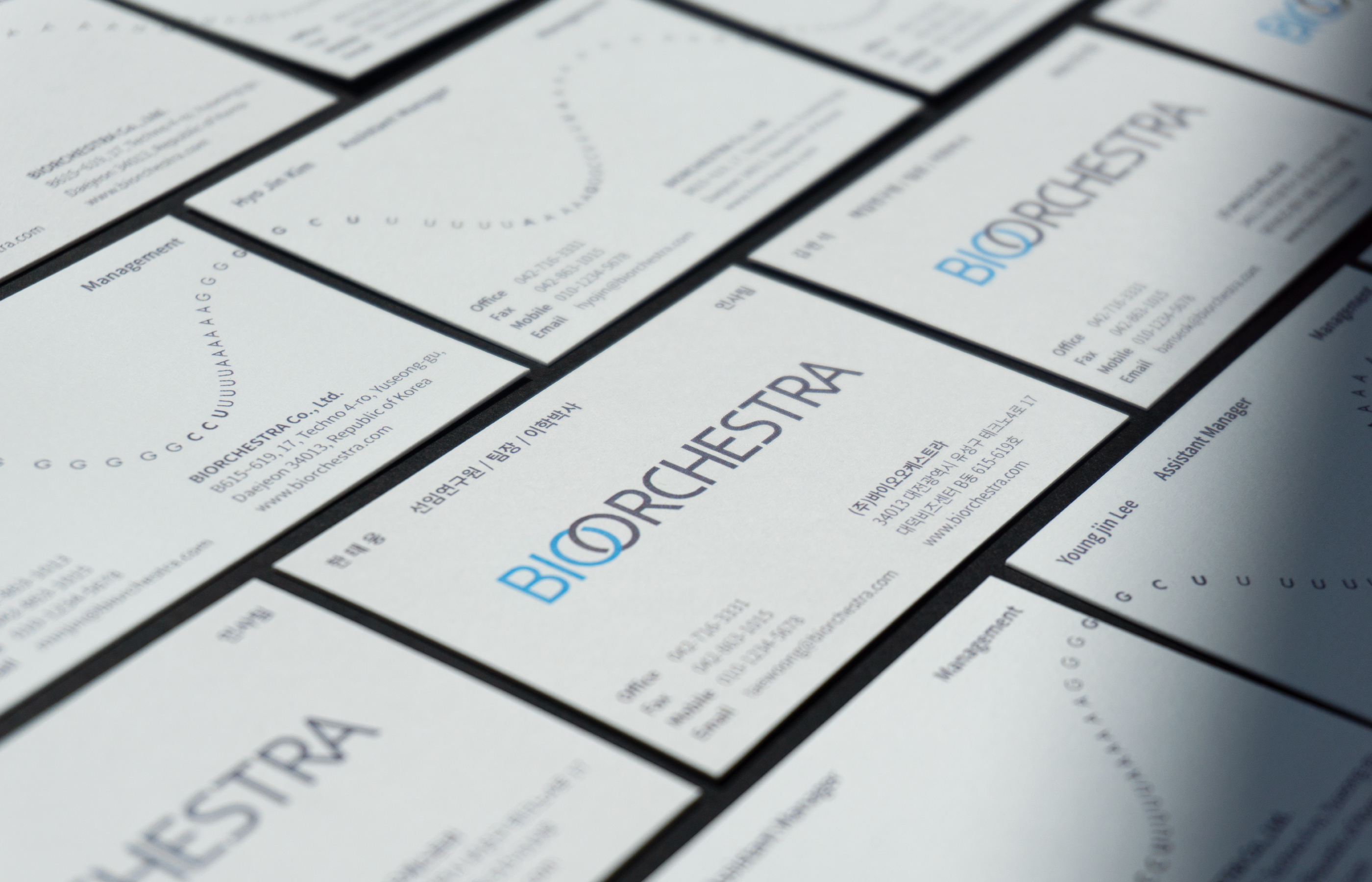


Biorchestra
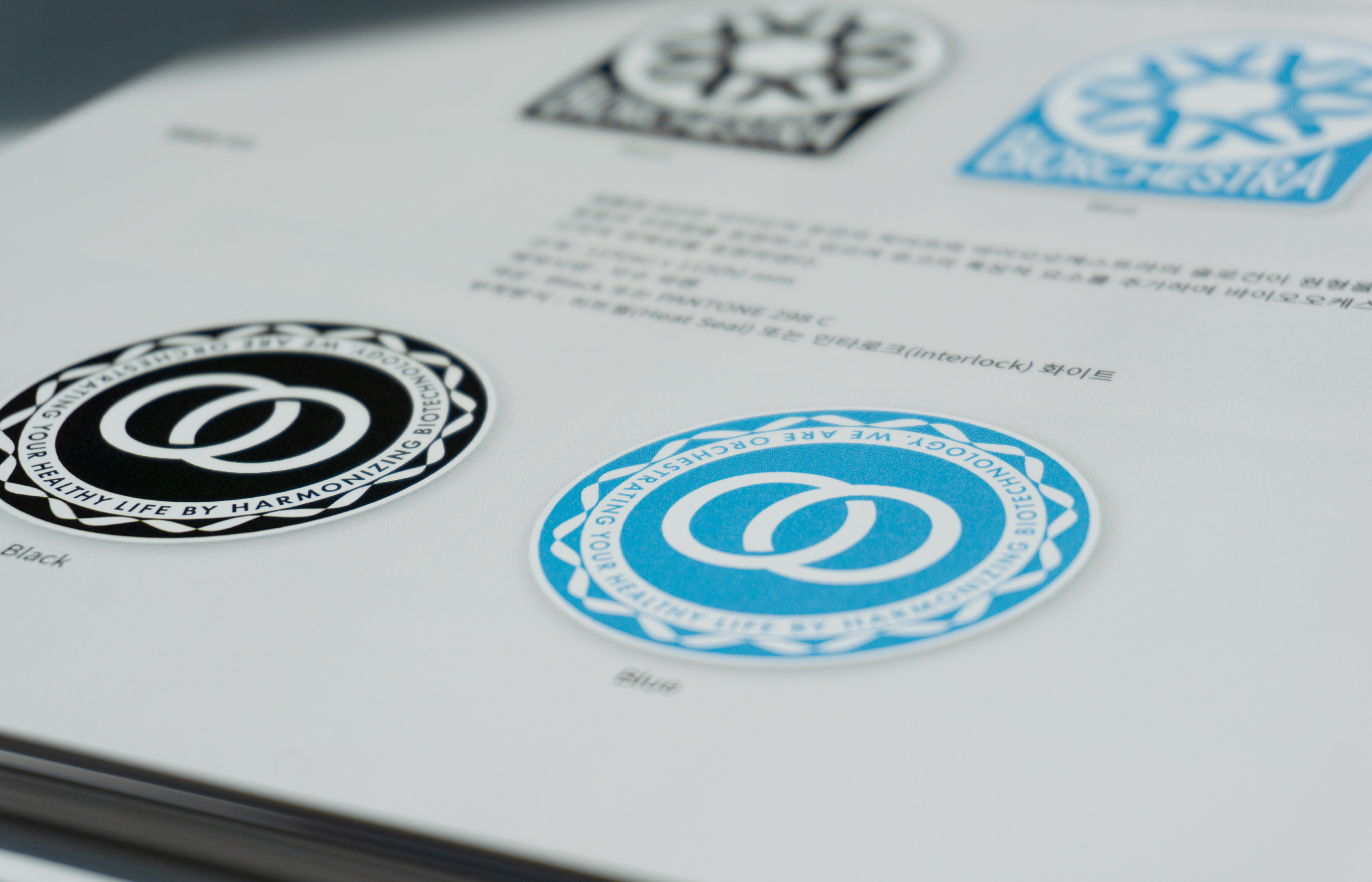
Client : Biorchestra
Goal : Brand Renewal
Production : 2019
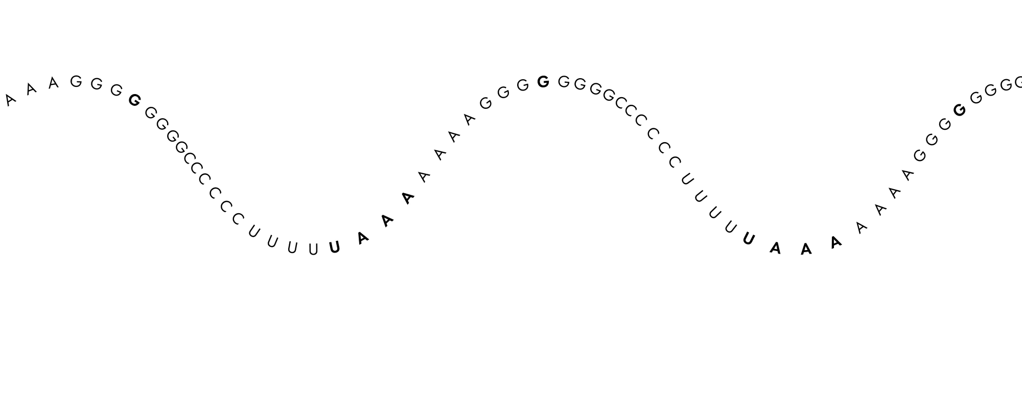
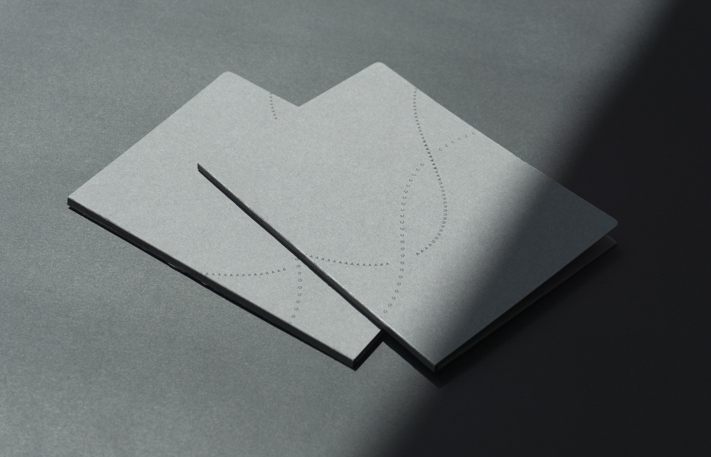
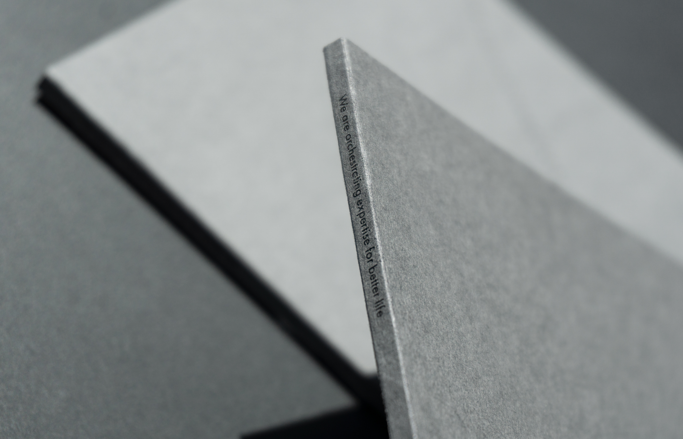
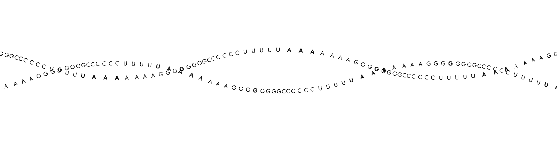
_바이오오케스트라는 난치병을 치료하는 신약개발에 매진하고 있는 과학자들의 집단이자 연구소입니다. 그들은 인류를 구원하고 진보를 이루어내는, 희망을 대변하는 따듯한 마음을 가진 사람들입니다. 우리는 바이오오케스트라가 하는 세상을 바꾸는 일, 바이오오케스트라가 가지고 있는 따듯한 마음을 디자인을 통해 드러내고자 했습니다. 그들이 연구하는 RNA의 염기서열인 AGCU로 잔잔한 선율의 형태를 만들어 바이오오케스트라를 표현하고자 했습니다.바이오오케스트라의 아이덴티티를 디자인하기위해 AGCU의 알파벳으로 다양한 타이포그라피를 시도했습니다. 그 중 희망을 선사하는 고요한 바이오 기업에 어울리는 타이포그라피의 선율로 그래픽 모티브를 지정했습니다. 브랜드 컬러는 스카이블루와 화이트 그리고 연한 베이지색의 조화로, 종이의 질감은 서걱거리는 촉감이 느껴지도록 하여 따듯함이 느껴지길 바랐습니다.
_BIORCHESTRA is a group of scientists as well as a research facility that is devoted tonew medicine development for incurable diseases. The people of BIORCHESTRA are warm-hearted, representing hope to save the humankind and make progress. We aspires to show what BIORCHESTRA do to change the world and their kindness through our design. We tried to express the identity of the BIORCHESTRA with the melody of typography. The RNA shapewas expressed using the AGCU alphabet, the base sequence of the RNA they are studying. This typography,as their name means, is reminiscent of the orchestral melody. The brand color was intended to express their warm feelings with sky blue, white, and light beige, and textured paper.
완벽을 넘어선 매력적인 브랜드를 디자인합니다.
오랜시간 사랑받을 수 있는 브랜드 아이덴티티를 구축하기 위해 전방위적인 브랜드 활동을 지원하고, 시장이 주목하는 브랜드를 만듭니다.
오랜시간 사랑받을 수 있는 브랜드 아이덴티티를 구축하기 위해 전방위적인 브랜드 활동을 지원하고, 시장이 주목하는 브랜드를 만듭니다.
Brand
Oenir
WAVE MODEL
WV
TinN
Laka
Celliviate
ILEG
Torriden BI Renewal
Biorchestra
잠깐학교
612 Language Institute
SM Town&Store
Oenir
WAVE MODEL
WV
TinN
Laka
Celliviate
ILEG
Package
Celliviate
Forest Shower
KUMO Holiday Kit
Torriden Package Renewal
Della Born
Torriden Dive in Serum
Torriden Influncer Kit
Torriden Sachet Kit
NOVOMICS Hello Kit
bbb.B / Baobab Brolly
Eat 4 U 수채지가
Eat 4 U 나만의 비밀 Water Mix
완벽한 시간을 위한 오브제
Eat 4 U 위대한 비밀
Web
WV Design
Celliviate
Torriden Renewal
612 Language Institute
Furniture
긋다
Celliviate
Forest Shower
KUMO Holiday Kit
Torriden Package Renewal
Della Born
Torriden Dive in Serum
Torriden Influncer Kit
Torriden Sachet Kit
NOVOMICS Hello Kit
bbb.B / Baobab Brolly
Eat 4 U 수채지가
Eat 4 U 나만의 비밀 Water Mix
완벽한 시간을 위한 오브제
Eat 4 U 위대한 비밀
Web
WV Design
Celliviate
Torriden Renewal
612 Language Institute
Furniture
긋다
Product
Laka
TinN_Shampoobar
Laka Soul Vegan Lip Balm
bbb.B / Baobab Brolly
Club Jasmine 2019 Calendar
Used Hair Dryer
Puffy Bookmark
Holder Series
Oasis
The Contrast
Lego Farm
Lighting Bag
Poster
We Need A Strong Hammer
Photo&Video Direction
Celliviate
Torriden BI Renewal
bbb.B / Baobab Brolly
Service Design
HEYGROUND
Laka
TinN_Shampoobar
Laka Soul Vegan Lip Balm
bbb.B / Baobab Brolly
Club Jasmine 2019 Calendar
Used Hair Dryer
Puffy Bookmark
Holder Series
Oasis
The Contrast
Lego Farm
Lighting Bag
Poster
We Need A Strong Hammer
Photo&Video Direction
Celliviate
Torriden BI Renewal
bbb.B / Baobab Brolly
Service Design
HEYGROUND